Pages

Search This Blog

Monday, May 28, 2012

Cabbage Rose Zendala

It is always amazing to me how Erin creates a template for the challenge each week and how different each person's work comes out.  This week, my zendala became a flower.  At first I wanted to make it into a budding peony but it came out more cabbage.  I'm calling it a cabbage rose.  It might be pushing it to add rose, but I'll see how far I can take it.  :)

This is a really simple zendala for me.  The tangle choices are few but this one didn't want to have a lot going on in it.  I really like it and the shading makes it interesting for me.

Not a lot to write this week as I have a FULL plate at the moment.  Lucky for you all.
Patterns: Fescu and Ixorus
One last thing, I finished shading the Sheriff's Zendala from last week's challenge.  Rather than update the original post, I'll just tack it on here.
Happy Memorial Day!  Have a great week.

Sunday, May 20, 2012

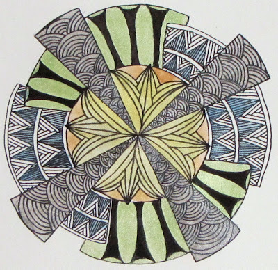
Starry, starry Zendala

This week Erin gave us the star treatment for the Zendala challenge.  I get excited to see what Erin has come up with each week and then I am surprised at what my mind's eye sees in the design.  In my first challenge I saw surfboards and in this challenge, I saw a sheriff's badge and gun.  I fought that idea at first though.  Guns and law enforcement are not exactly zen.  Know what I mean?

So, fighting the idea of guns, I went first to flowers.  I started in the center here and added Arc Flower to the circle. I put Knightsbridge in the center to give it a little more interest.  Next I did the points of the stars.  I was tempted with other patterns but I wanted to play with stripes.  I divided the point to give the stripes a little more interest.  I repeated Knightsbridge in the smaller circles for several reasons.  One, I wanted to repeat to tie it in with Arc Flower and the other was to bump up the graphic-ness of the zendala.  That left me with the beautiful scalloped section to work with.  I was stuck here as I wasn't sure what to use.  In the end, I kept it simple.  I divided it into sections and drew lines.  To my great surprise, the lines seemed to set the Knightsbridge circles off so I shaded them to further pop them up off the page.

I haven't gotten any of the round Zendala tiles yet.  I'm putting them on my wish list though. Maybe for my birthday this fall someone will surprise me.  I liked the idea of the circle so I just traced everything onto a piece of watercolor paper.

The whole time I was working on the Zendala above though, I could not get the badge and gun image from my mind.  So, I decided to just do one anyway.  I traced out the design on some drawing paper and went to work.  I looked at images of sheriff's badges on line to give me some ideas of what they look like.  Braided edges were often repeated so I used those.  I added a few lines to reinforce the star.  Then it was time for my gun.  I found out that the chamber of a gun is not usually decorated.  Not on the side that would be visible on this angle anyway.  I tried to make the circles look as if we were looking through the chamber of an unloaded pistol.  I haven't done any shading yet.  I may go back and add some.  The weather was so nice today that I went ahead and photographed this.

Thanks so much to Erin for creating these templates each week.  I don't know how you do them, but I am so very glad that you do.

Sepia Challenge

I am late! It was a busy week here.  School is out soon and there are lots of goings on that kept me away from  blogging.  I was able however, to squeeze in the challenge from The Diva.  I like using sepia markers for zentangle drawing.  I think that they can be just as zen as a black micron pen and maybe even more so, as the brown is easy on the eyes.  Well, mine anyway.

Since I'm late, I'll just cut right to the chase.
I have a set of sepia pens as well as the lighter brown one that you see here.  I kept it pretty simple using only the three tangles.  The bottom is my first try at the new tangle Pea-nuckle.  That deserves some more attention. I have the basics down but I tried to crowd it here.  I think I'm in need of a new 01 sepia micron too.  The top is Atorm.  I messed up in my initial grid so I had to do a variation instead.  The middle is Ticking.  I was playing with it a bit and trying to make it look like a bit of a stripe.  I don't think it looks like I hoped but I still like it.

I am looking forward to summer break.  Things will settle down a little, and that will be nice.  I will have to fight the kids for the desk top a bit but as Mom, I get to trump their game playing.  :)

Have a great week!

Thursday, May 17, 2012

Color in New Sizes

I am still exploring using watercolor with Zentangle.  I learn more each time and am finding this a lot of fun.  I have tried the standard 3.5" X 3.5" tile, Artist Trading cards, 5X7" and working on a 9X12 page.  Each size can present its own challenges and each brings a new experiment to learn.  The only constant that I find so far is that everything is different each time.

I think that I MIGHT have figured out how much paint is too much though.  On a few ATC that I painted over the weekend, I just dropped the watercolor on the wet card and let the paint flow where it may.  While producing a lovely effect, it left a lot of the watercolor on top of the paper.  Too much paint on the paper will disrupt the ink flow from the Micron pen.  The end of the pen, picks up the paint causing the ink to stop.  Good news is that you can write or wipe it off and the pen works fine again.  I think to finish a spot or two I will have to use a Sharpie Pen to finish.

Sometimes there are places on the ATC cards where the ink from the pen bleeds a bit.  I am not sure if this is how the ink flows on the watercolor paint, or if that the paper was wet changes how it accepts the ink.  The bleeding isn't bad though.  The line is a touch thicker and is darker in those spots.  My main concern with this however, was that the bleeding would pull the ink from my Micron faster than normal.  Then I remembered that I had a few older pens that didn't work as well any longer, they left skips and/or a lighter line, and wondered how they would work on these watercolor places.  I am happy to report that they work great!  It is almost like having a new pen. Plus I don't worry about those pens losing ink too fast.  I had already written them off but was keeping them around because I couldn't bear to part with them.  The old pens now have a home in my ATC kit that I am keeping in my purse.

Color Wash

This is the first ATC that I tried with watercolor.  Again, I just followed the paint as the string. The pattern on the left is a variation of Atorm.  I wanted to let that beautiful blue show through.  When I was photographing it, the light caught the pencil shading that I did and gives the photo a shine that isn't in the original.

I like these small sizes.  This one is done on a Bristol card.  I just bought some watercolor paper sizes that I have painted and will try ink on next.  I am interested to see if the ink will flow differently on the water color paper.

Aliens

Aliens was an experiment with less color on a page.  After I got all the lines drawn, it looked like some alien life forms.

Before I started playing with the ATC size, I started doing a 5X7" size.  I liked how it was going and was moving right along on it but then I got to a section and was stuck.  I couldn't decide if I wanted to add a tangle or not and if I did add one, I couldn'd decided on what pattern to put there. So, I set it aside and waited for an answer.


Last night I was trolling Pinterest for some inspiration and found Braids.   I love the flow of this pattern so much.  The site is in German though, so if you would like to read the great lesson that Simone Bischoff has posted I would recommend it. So, braids... This morning I flipped back to the 5X7" piece to see what new things, if any, it had to say.  I had braids in mind so I thought that I would try it in my trouble spot and see what happened.  I am sooo pleased to say, it worked great!
Color Study
The "steps" there are my try at Planateen that went terribly wrong.  I did it fine on my practice of the pattern, but once I put my pen to the paper, I lost my mind.  Luckily, I think that it came out ok despite my best effort to mess it up.  In this piece, I still used the color as a string, but wasn't as fussy about it.  I also drew on the white paper.  Some bits are more successful than others but on the whole, I like it.

Thanks to all of you for the great feedback that you have been giving me on this journey into color.  It helps so much.

Monday, May 14, 2012

Deco 'Dala

This week Erin at The Bright Owl created a Zendala template that reminded her of art deco design.  After I looked at it for a while, I had to agree.  I really do like the art deco style.  While it isn't a style that I would normally decorate with, I enjoy looking at examples and studying it.

I took the idea of art deco and tried to apply it to my Zendala.  I spent hours on Saturday looking at images on my computer trying to find patterns that I could adapt to the challenge.  In the end, I didn't create anything new but the top of the Empire State Building did give me some great ideas for the future. But, like my wanderings on the Internet, I digress.

Deco 'Dala in black and white
For this Zendala, I started in the middle.  I used Hi-C's here.  I really love Hi-C's because here it looks so art deco to me.  Here it looks like a lily, but if you put the pattern in back to back squares, it looks totally different.   It is a wonderful pattern because it looks so different in different places.  I used the arches on the triangle.  Does anyone know the name of this pattern in Zentangle?  It pops up a lot in art deco design.  I opted to keep the semi circle sections the same all across.  I just couldn't divide the space in a way that I liked.  I used a variation of Hibred.  It is kind of a blending of Hibred and Knase.  The black "columns" are a copy from an incredible art deco door I saw.  I wasn't sure that I liked them at first, but they came to grow on me.

After I got this Zendala done, I wanted to play with color a bit.  What I didn't want to do was to draw a second Zendala though.  I was really quite happy with what I had already done so I just kept it.  Taking some advise that Genevieve gave here at Amaryllis Creations, I photocopied the unshaded drawing onto watercolor paper.  I bought some inexpensive pearl watercolors a month ago and got them out to try.  I thought pearl would lend itself to art deco.  Lots of shiny in art deco.  :)

Deco 'Dala with watercolor

I used the silver, gold, blue, green and yellow pearl watercolor and added it right over the top of the photocopy.  The photocopy didn't smear or run with the water nor did it rub off with the brush.  After I finished painting, I let it dry for a few hours.  I noticed  that the black of the photocopy was not as dark as I now had a nice shimmer over the top.  I took my micron this morning, and went back over the lines were and the black popped out again.  I could have left it where it was but I wanted a blacker black.  I guess I ended up drawing the Zendala after all.

I hope you like them and welcome your comments and feedback.

Tuesday, May 8, 2012

More Mini Canvas!

It must be the warmer weather, a try at an etsy shop, or (most likely) the materials, but I am on fire lately.  I am full of inspiration and energy.  I Love it!

I have a few more mini canvas done and I wanted to share them with you.

Spring Walk
I am starting to learn that I cannot tangle the same way on the canvas as I do on paper.  The most obvious reason is that I am working with oil paint markers rather than a pen.  The tip is bigger on the paint marker so I need to "biggify" my tangles a bit so I have plenty of room.  Too small, and the paint can fill in the white space where I don't want it to go.  I know that I could always paint over a canvas that I don't like, but I don't want to do that if I don't have to.  What I like most/ and sometimes least about the bigger tangle, is that I really have to think about the structure of the tangle.  It have given me a new way of looking at the tangles themselves.  What kind of ways can I vary a pattern and still have it work and look good.  It is also teaching me that less is more.  Not every inch of the canvas needs to have paint on it.  Sometimes the negative areas can have the greatest voice.


Borders


 I really love the white lines that seem to sit atop tangles when people draw them in.  They run along the surface and bring such nice light to the tiles.  This was my attempt at those lines.  I'm still working on them being successful, but I think this one came out well.  It reminds me of the landscape from an airplane window.


Festoon
I call this one Festoon because the Purk looks like a jewelery bauble.  I had a lot of fun making this mini canvas.  I started it with the curved lines and Purk and then set it aside for a few days.  The grid pattern was going to be Versa but I didn't finish it all the way.  I guess it is still Versa.  To finish this one off, I went in with a white charcoal pencil to add "shade".  I kept the charcoal to a minimum and used a blending stump to smudge it and smooth the look.  I love this so much and I am certainly going to do more white on black.  I have a larger canvas that is calling out to me.  :)

Thanks for taking a look!

Do do do do Feeling Groovy!

It is a new month and a new tangle!  The Diva adds to the challenge on the first Monday of the month to try out a tangle that one of our fellow Zentangle enthusiasts has come up with.  This month the tangle is Groovy by Eden Hunt.  Check out her blog and the pattern here.  Since this tangle was posted to Tangle Patterns, I have admired Groovy but not had a chance to try it out so I was excited to see it as the tangle to use.

I must confess that I did not practice groovy before I started my tile.  I just jumped right in with both feet and let the lines fall where they may.  I am pretty sure that I didn't make groovy quite right but I am looking forward to getting better at it.  I really like this pattern.  The look of it is really quite lovely and it looks far more complex than it really is.

I used on of my watercolored tiles for this challenge.  I am still toying with this idea so I thought I'd work on the challenge of the color along with the challenge of the tangle.  To start, I penciled in my lines of groovy.  Sometimes my wavy lines take on a mind of their own, so I wanted to be able to erase any wild curves.  I think that my being so careful kept my curves too small.  Groovy wants to be a bit bigger than I made it I think.  There needs to be more space.  I don't dislike my attempt, but I did learn what I need to do differently next time.  I also learned a neat thing.  If I lightly erase over the watercolor, some of the color rubs off giving the color added variation.


Again, I used the color as the string.  This was a little of a challenge in a few spots as the color fades out and I sometimes stopped the pen before I should.  Stiricles makes an appearance in this tile.  Last week wasn't enough I guess.  As I wanted the color to be visible, I didn't black out where I normally would but used lines instead.  I like how it came out.

Thanks to Eden for a great tangle.  I really look forward to using Groovy in the future.  Thanks Laura for all you do for this challenge!

Saturday, May 5, 2012

Zendala Challenge

I'm a little late to the Zendala party that Erin is hosting over at The Bright Owl but I am glad I found my way there.  The Zentangle community is awash with Zendalas these days and everyone of them is incredible!  I have done a few and I have to say that I love them.  I'm always keeping my eye out for a new pattern to use.  I am NOT geometry inclined so creating my own is out. Thanks to Erin and her challenge, I can find a new pattern every week!

So, I am starting this challenge at week 4 and it comes with not just a pattern, but the added challenge of using the themes of sea and Mexico as well.  Erin is on a vacation cruise in Mexico so you can see where her inspiration came from.  (Totes jealous BTW).  So, let's jump right to it!

Bic Mark-It markers on Mini Canvas Panel
When I looked at the pattern, all I could see were surf boards.  The challenge of sea fit this nicely but then I wasn't sure how I was going to make surf boards.  All I could think of were flowers, so I chose some bright colors and went for it.  I'm not sure how "Mexico" this is though.  It seems a bit more Hawaii.

Thanks for taking a look!  I hope you are/had a great time on your trip Erin.  Thanks for the challenge.

Wednesday, May 2, 2012

Working with Color

Last month when I was working on an Illuminated Letter, I toyed with the idea of adding a water color wash to the piece to add just a little more to the design.  In the end I decided not to because you can't remove the color once it is there.  I still want to explore the idea some, but there are a few kinks for me to work out.  The most important is: I don't know anything about watercolor painting.  A pretty big hurdle don't you think?

The day that I bought watercolors, I spent an hour or so exploring them.  I wanted to see how the paint worked with the water and the brushes.  In the end, I had a sheet covered with brush strokes and puddles of color.  When I looked at the sheet by itself, it looked like just what it was, a test page, or maybe some of that "abstract" 1980's paintings that were popular in doctor's offices.  I didn't toss the paper though.  I figured that I could always use the back as a scribble spot for pens, practice space or whatever. 


This weekend, I decided to cut the page up into different sizes and tangle over the watercolor and see what happens.  It was fun.  The watercolor paper takes the ink a little differently but not in any obvious way.  The paint on the paper didn't seem to affect the micron at all.  I wondered if the paint would be picked up my the pen and cause a problem but it didn't. 


First try. Watercolor paper, watercolor, micron pen and pencil.
I started with 2 3.5" squares that I cut like a tile for Zentangle.  In the first one (left), I wasn't sure if I wanted to tangle over the paint or not.  Should I let the color stand alone or use it as a way to enhance the design?  In the end I did both.  I kept some patterns on the color, as if the color was the string.  On the left side, I drew a small string to determine the space, but chose not to cover the paint.  I really love how the variance in the paint color gives the tangles depth and light without shading.  After finishing, I went in with a B shading pencil and a blending stump and added in a little shade here and there.  The pencil shaded very nicely over the paint.  I didn't have to press as hard and the shade was more even. (It seemed so anyway.)


Second try
There was more color in the second tile, so there was no choosing where to draw.  This time, I let the colors be the string.  I used the B pencil again for shading and kept the shade to the patterns alone for the most part.  My favorite part of this tile is the way the orange and blue paints mix to create highlights.

Just in doing these two tiles, I already have ideas on how to paint the next time.  I don't think that I need to have a full page of paint.  I think having unpainted spots will be nice.  I also think blending dark colors into lighter ones will be a nice touch.  I have the whole first sheet I want to use first.  I am on a third and larger (5X7) and have found more fun things to try. 

This is a new direction for me and a fun one.  I am excited to see where it grows from here.  In the last few weeks, I have been really productive (for me) and these two tiles were finished really quick.  I'm not sure if it is my excitement for something new, the simplicity of the patterns, or maybe the both, but I surprised myself at how quickly they went.

Thanks for stopping by and taking a look. 


Tuesday, May 1, 2012

Trying on a new size

A long time ago I picked up some artist trading cards at the craft store.  At the time I didn't know what they were.  I just thought the little 2 ½ X 3 ½ inches cards were cute.  They also come in a variety of papers so I thought it would be a great way to try out paper without a big investment.  Last week I tucked a package into my purse along with a micron.  My thinking was that I could pull them out at work when/if I get caught up and need something to keep busy.  I am interrupted often at work so an ATC is great.  A smaller size gives me smaller sections to work on, so I can fill them quicker and not worry about forgetting where I was.

So far I have finished one and am halfway through another.  I love these little tiles because they are a great way to practice patterns, or try out new ideas.  I know people trade these with each other but I have no idea where.  If you would like to trade or can advise me where to post for trading, I would love to know!

Duo Tangle Challenge

I love the challenge of a limited tangle choice.  Sometimes I get so overwhelmed with the many tangles there are and/or with the idea of finding the "right" tangle pattern, that I end up sitting and thinking instead of just drawing. In a duo tangle challenge, the choice of pattern is decided and I can turn my mind on to variations, string and shading.  This week, the challenge from The Diva is to use only Hybrid and Strircles, two official Zentangle patterns.  I recently rediscovered Hybrid and have been using it again after a break.  Strircles is a tangle that I have used before but not a lot.  Using these two for the challenge has refreshed them for me and I am sure I will have them back in my work again.


At first, I wanted to see if I could find a way to combine the two patterns into one but I gave up on that idea. After looking at some of the tiles in this challenge I'm glad I did.  There are a lot of you out there that were much more successful at combining them than I would have been.  I did try to bring a little of Strircles to Hybrid in the lower right side.  I don't know that Hybrid echos Strircles here, but I do like the black on white coupled with the white on black.  This is the first time that I put highlights on the "bubbles" in Strircles.  It's funny, I have never seen the circles as bubbles before.  More of just a way to vary the black and white in the pattern.  This is why I love the weekly challenge, it forces me to look at patterns in a whole new way.

I really like this tile.  It has been a while since I finished a challenge piece and thought to myself "Hey! That's some good work you did there!"  Thanks to Laura for this, and all of the challenges.  Thanks to you visitors from dropping by and being an inspiration to me.